Our sketch this fortnight was designed by Tristan of Tinstar Designs. She is loving banners right now so naturally wanted to make sure her sketch featured them. Enjoy everyone's creations and don't forget you can easily Pin the images if they take your fancy by hovering over the image and then the "P" button will appear! :)
First up is Tristan's design (Tinstar Designs). She has 65 Christmas cards to make each year as she likes to send cards to all her family and friends all over the world and thought this month was a good time to get started. 1 down, 64 to go!
My sister made these cards! My favourite of the two is the top one because of the gorgeous vintage floral stamped banner, but they are both beautiful aren't they?
This lovely design was made by Eliza Childs. Instead of using large banners she opted to do smaller and using a floral ribbon, which is was a lovely idea.
These two stunning cards were made by Mary Shapley who is a downline of my downline! I am really loving her black flower in the top card!
Michaela has joined our challenge group and this is her first creation. It is pretty awesome isn't it? I love the new chunky baker's twine that she's used. And of course the green!
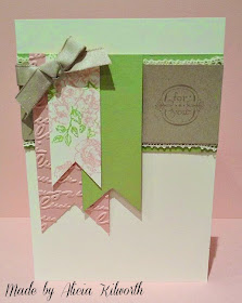
Now for my cards. I was feeling a little lazy for my first card design. It was late at night and I was getting tired, but I really wanted to try to make at least one card for the challenge before I went to bed. I remembered I had a baggie full of unused gift tags and embossed cardstocks from projects that I didn't finish in the past. And this is where I found a set of 3 matching gift tags that I made for a display for my catalogue launch last year! They work perfectly as a slightly different interpretation of the sketch!
Then my second card design. I was feeling indecisive. So I turned to my colour coach and randomly chose a colour. The colour I chose was Basic Gray. I turned over to the back of the card for some colour combination ideas.
I chose the top colour combo! It was a combo I had never seen before so thought I'd give it a whirl and this is what I came up with.
I think it is actually quite an awesome combo. I especially love the green and grey together and am hoping to try and use it again soon on another project.
And that wraps up yet another Sketch Layout Challenge. If you're a card maker yourself and you'd like to take part in our challenges in the future just pop over and join our group here. We'd love to have you.


Love all the banner cards & yes we call Tristan the "Banner Queen" over at StampNation as she has the best banner cards ♥
ReplyDeleteI loved this challenge. I did a very simple card, but sometimes simple works. I love love love your first make Christy, using the scallop tag topper punch and the colour combo looks amazing!!!
ReplyDeleteKhelraja has done a good job creating an entertaining and user-friendly platform. The buzz around Mumbai lottery winners today keeps users curious and active. The games Gulumber feature adds something different compared to usual casino sites. Playing keno on Khelraja feels simple and enjoyable without unnecessary complexity. The service runs smoothly, and everything is easy to understand. It’s a good choice for people who enjoy classic games with a modern presentation.
ReplyDeleteA Public limited company definition is a business entity registered under the Companies Act, 2013, that is permitted to raise capital from the public by issuing shares. It must have a minimum of seven shareholders and three directors, with no upper limit on shareholders. This structure is suitable for large businesses seeking expansion, investor confidence, and transparency. Public limited companies follow strict compliance and disclosure norms, making them a preferred choice for businesses planning long-term growth.
ReplyDelete